Direct Digital Holdings Brand Refresh
OVERVIEW
A strategic brand transformation into a more refined brand presence
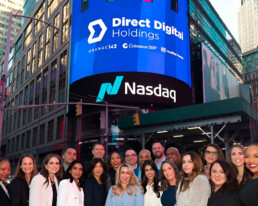
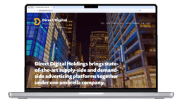
Direct Digital Holdings brought me in for a brand refresh as they entered a new era. After becoming a newly publicly traded company, they wanted their new status to reflect the company's new brand strategy and trajectory. Their new brand strategy required their visual identity to evolve and transform the brand into a sharper, more modern identity, better aligned with their growing market position.

CHALLENGE
Direct Digital Holding’s brand refresh didn't exactly bring a challenge; it actually brought forward an opportunity. Their old branding felt dated and in desperate need of revival. This project wasn’t about solving a complex problem; it was about unlocking potential and breathing new life into their old identity. It was an opportunity to bring clarity, sophistication, and modernity to a brand ready to step into its next era.
SOLUTION
To modernize the brand and enhance its market presence, I introduced a more contemporary design language. This meant updating typography; their existing color palette was retained, but elevated through a lighter, more spacious approach: I increased the use of white to allow the core brand colors to feel more vibrant and alive, while cool grays balanced it out, moving the brand away from its previously dark, heavy aesthetic. Through updated typography, a streamlined color system, and more intentional use of colors, space, and hierarchy, the identity now reflects a confident, future-ready brand without losing its recognizable core.

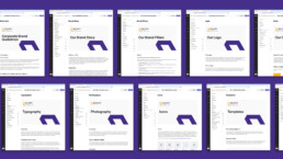
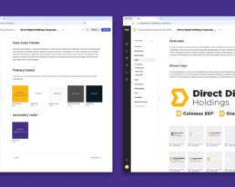
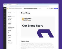
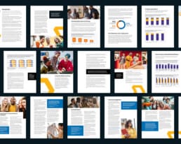
BRAND GUIDELINES
Taking an old, outdated visual identity that had no brand guidelines and no brand strategy. Their visual identity no longer matched the company’s growing momentum; their lack of consistency was creating internal confusion, and their inconsistent design and lack of structure weakened the brand perception.
SOLUTION
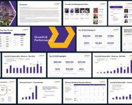
To ensure consistency across internal and external teams, I created a comprehensive brand guidelines that support the brand refresh. I custom-built a brand resource center for all Direct Digital Holdings companies (Orange 142 and Colossus SSP) and team members to access. This ensures every touchpoint reflects a more unified, modern, and elevated identity. Establishing clear guidelines ensures the brand shows up with clarity, confidence, and credibility.
This included defining core elements such as typography, color systems, layout structure, visual hierarchy, and usage rules. Beyond aesthetics, the goal was to create a scalable framework that strengthened consistency across marketing, sales, product, investor communications, and internal teams.
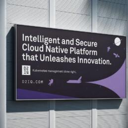
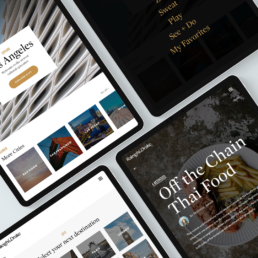
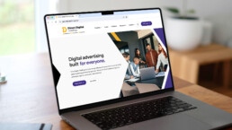
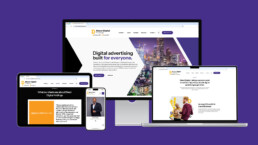
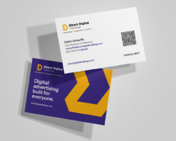
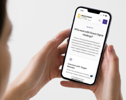
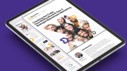
MARKETING COLLATERAL, MARKETING TEMPLATES, & MARKETING WEBSITE
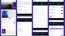
Once the brand refresh was established, Direct Digital Holdings asked me to apply all the brand refresh elements to everything across all marketing channels. This required applying it to a vast amount of deliverables, including marketing collateral, marketing templates, and a marketing website.
SOLUTION
My solution was to follow a pattern that ensured visual consistency, clarity, and messaging alignment across all marketing material. This was achieved by defining grid systems and spacing rules. Selecting high-resolution images that enhance the visual experience and reflect the brand’s tone and relevance to each variable, establishing a visual hierarchy for layouts, and applying consistency in iconography and graphic elements. For each asset, I combined a clean composition and a consistent visual rhythm that created a cohesive and polished look across all collateral and marketing materials.
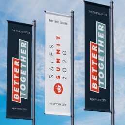
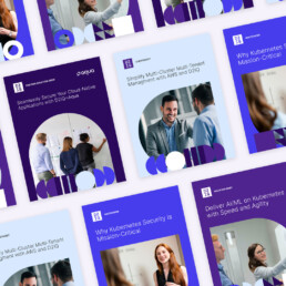
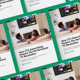
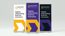
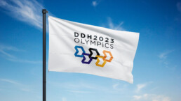
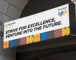
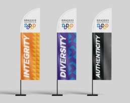
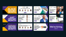
EVENT BRANDING & SOCIAL MEDIA
With a new brand refresh system in place, the challenge was to make sure that all brand refresh design elements remained scalable and adaptable for multiple formats for (Trade Show Banners, Social Media & Event Branding) all needed to reflect the refreshed identity — while accounting for scale, visibility, and fast-moving communication formats. Maintaining brand consistency while still being bold, modern, and eye-catching to be able to compete in a high-traffic environment with limited time to capture attention. Each channel required a tailored approach to ensure the brand remained consistent while still adapting to different formats, scale requirements, and audience touchpoints.
SOLUTION
To address these challenges, I created a modular design that could scale across multiple sizes without losing visual impact. I introduced brand elements like color, typography, and patterns to drive consistency, while allowing room for creative variations so each channel could stand out on its own.
For event materials, I designed a cohesive set including stage visuals, signage, badges, and collateral, all aligned with the brand refresh. I applied a consistent design language across physical and digital touchpoints to reinforce brand recognition.
For social media, I created a set of reusable templates that maintained brand consistency and established visual rules for imagery, typography, iconography, and layouts. These templates could be used for carousel posts, short-form video, or single images, all while keeping a consistent style for photography and design elements to make posts instantly recognizable.
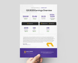
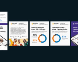
INVESTOR RELATIONS WEBSITE
In addition to the marketing website, Direct Digital Holdings asked me to help design an Investors Relations website to provide a centrilized, accessible hub for all financial and corporate information. This included earnings reports, SEC filings, stock data and governance materials and the latest corporate news. The challenge was to turning highly detailed and very data-heavy content into easy to undersant and easy to digest while applying the all new brand refresh to reinforce authority and transparency through hierarchy, clarity, and tone.
SOLUTION
I helped design the Investor Relations website to translate complex financial data into a clear, intuitive experience that better aligns with the refreshed brand identity. I established a structured information hierarchy for earnings reports, SEC filings, stock data, and governance materials, making key insights easy to scan and access. Visual cues, refined typography, and a consistent design system reinforced credibility and trust, ensuring the site felt both investor-ready and future-focused.