Red Sift, Refined
OVERVIEW
Transformed, designed, and built a dynamic experience for Red Sift’s homepage, a sales deck, and a custom google slides template.
The aim was to bring new energy and clarity to Red Sift’s online presence.
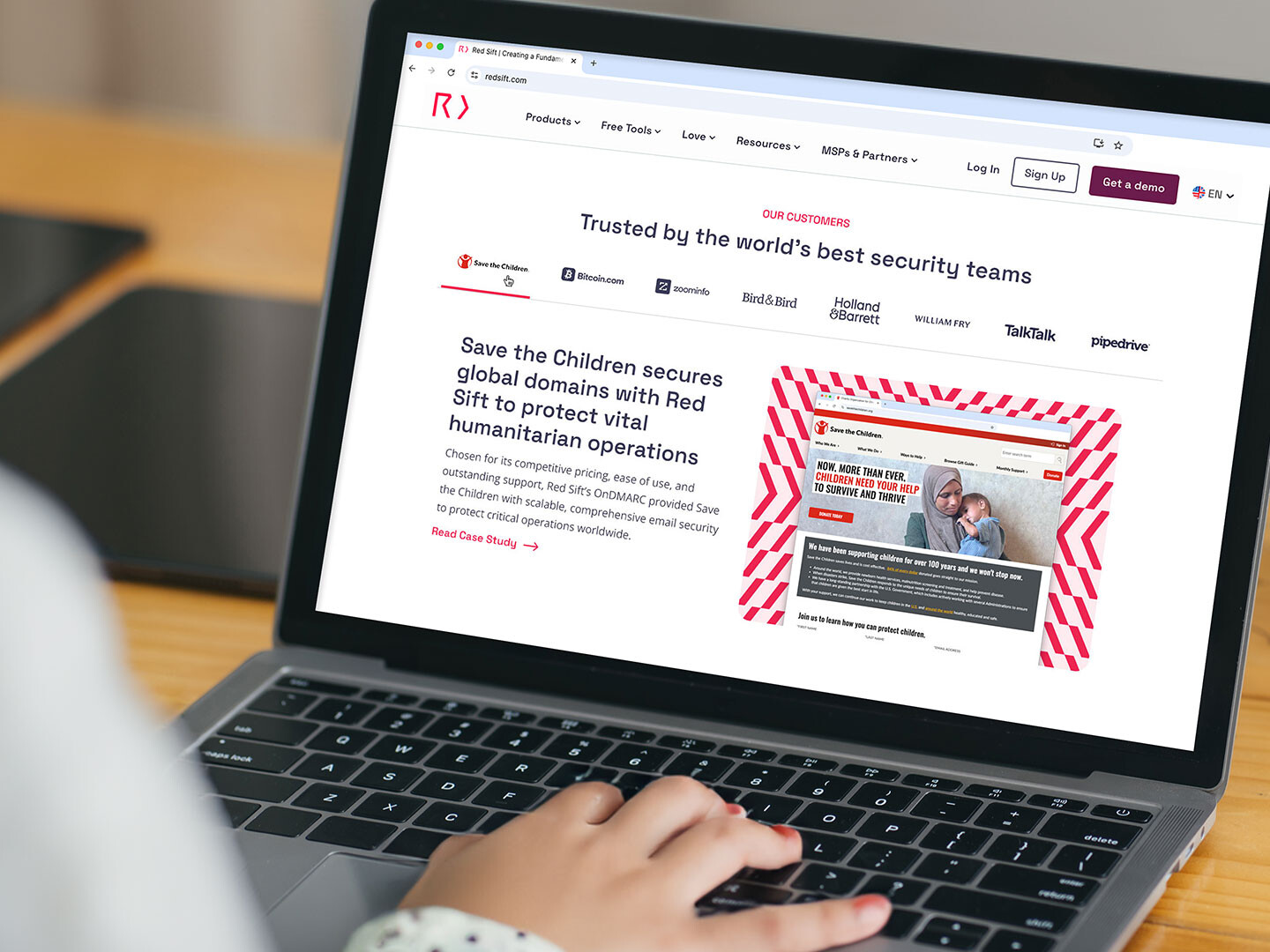
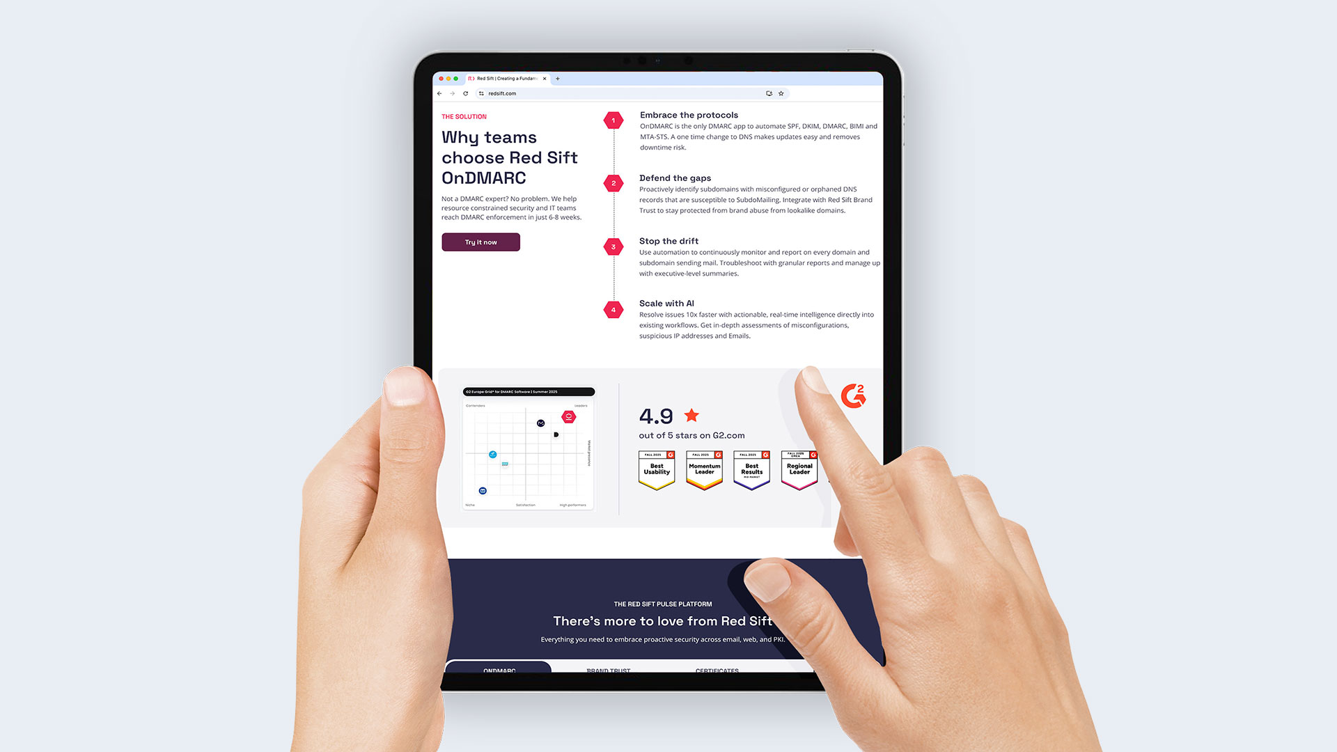
HOMEPAGE REDESIGN
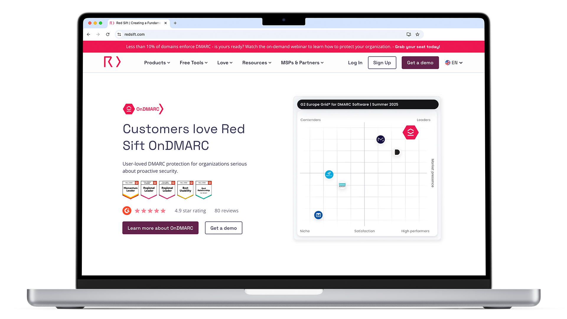
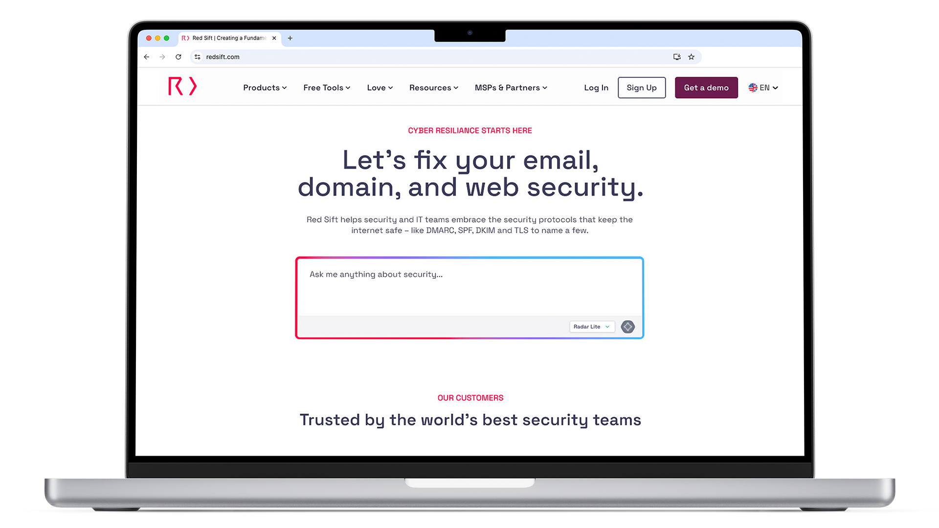
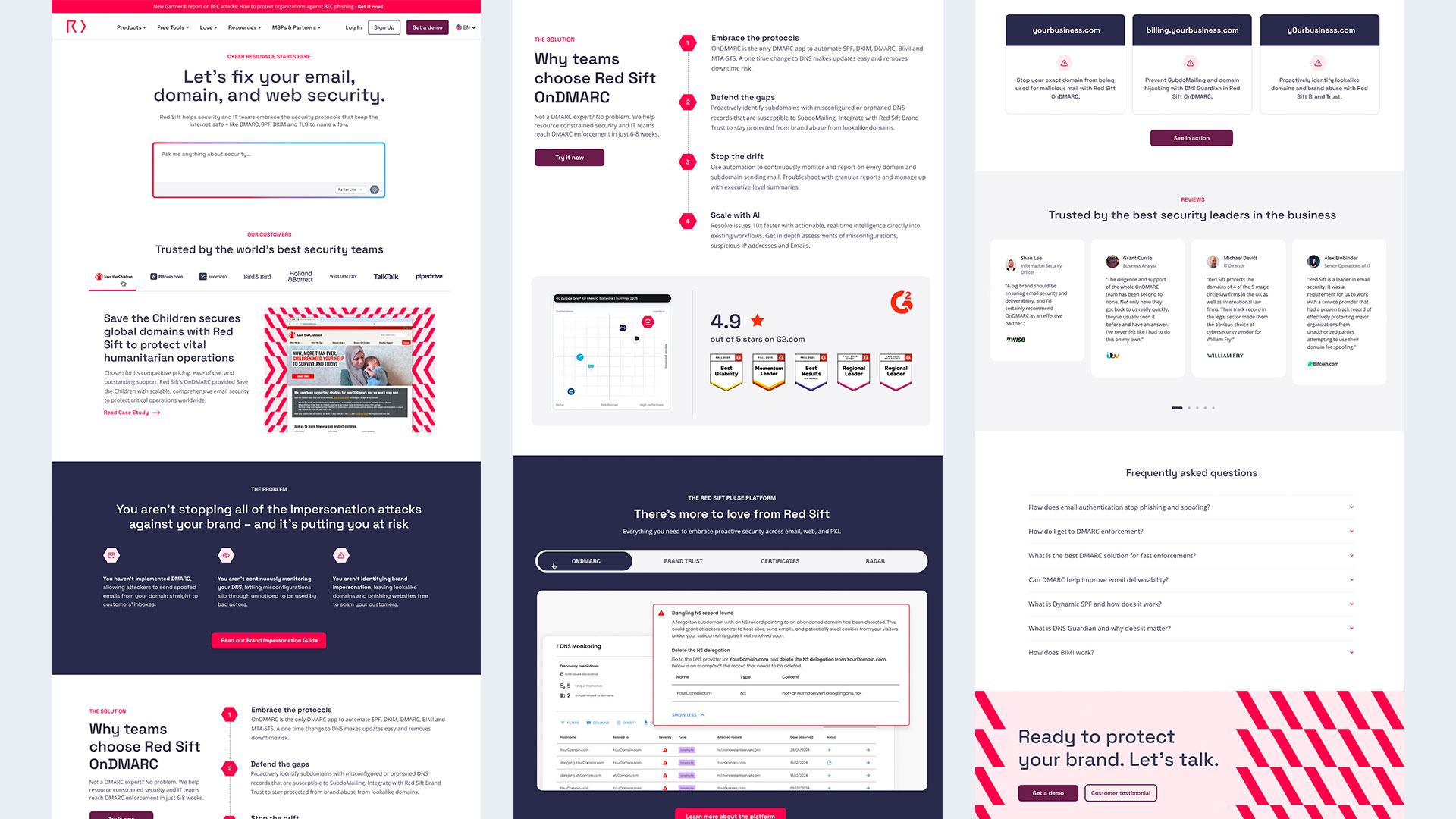
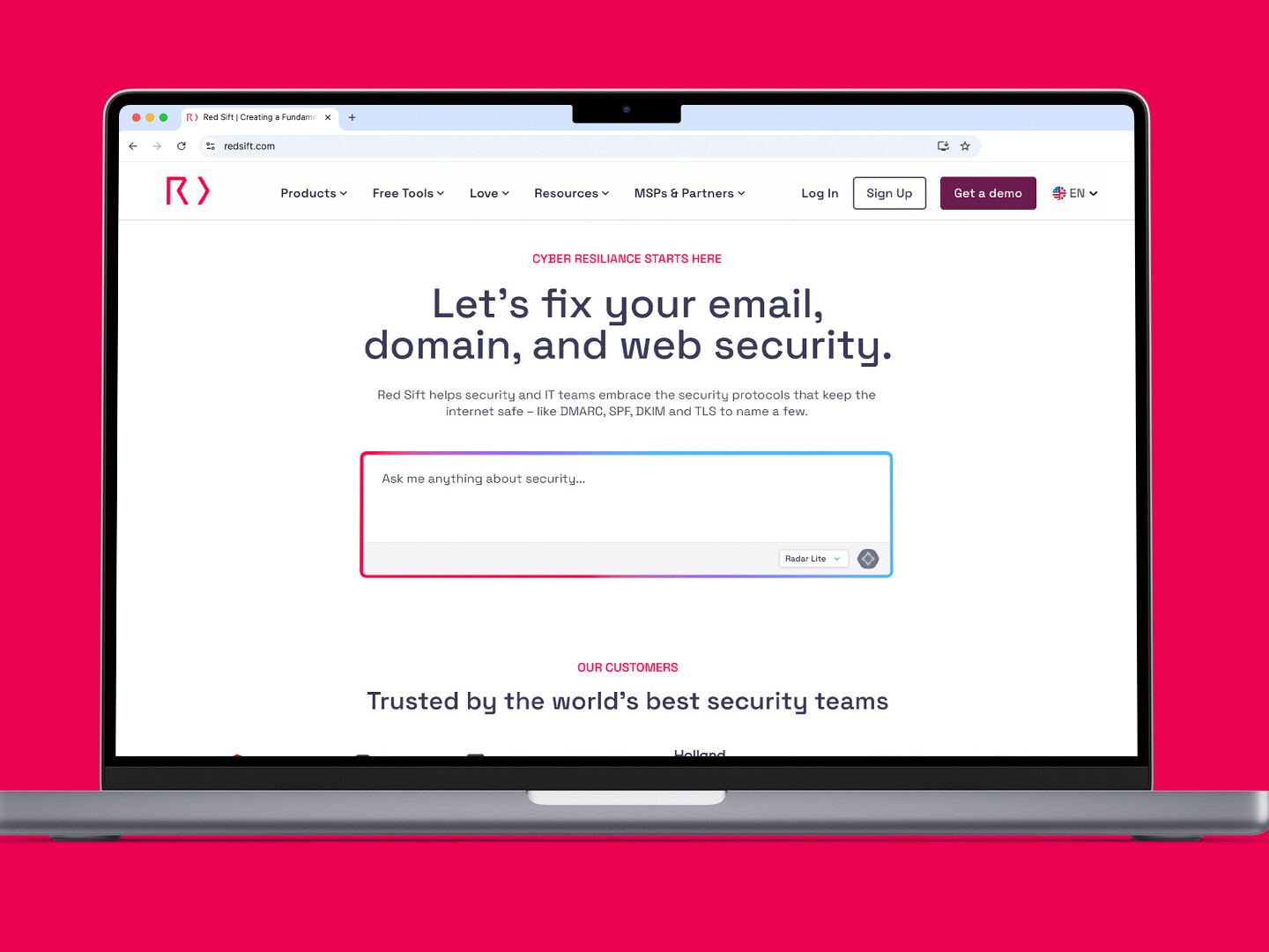
Reimagined the homepage with a clean, modern layout that reflects the brand’s personality and purpose. The new design clarifies the visual hierarchy and brings structure to the online experience, positioning the brand as a confident, enterprise-level presence.
CHALLENGE
Recraft the website into a striking digital experience that accurately reflects the Red Sift brand, transforming a basic product-focused platform into a cybersecurity enterprise using their already existing brand guidelines.
SOLUTION
Red Sift Refined- The goal was to breathe new life into the homepage and revitalize the digital experience. This was achieved using visuals from their existing brand guidelines. The aim was to drive a better user experience and establish Red Sift’s authority as a cybersecurity enterprise platform. Design elements now better reflect the brand’s visual identity. The new homepage features sections such as the Hero section, which lets customers see their own cybersecurity vulnerabilities. This creates urgency and desire for Red Sift services. The homepage redesign also includes a case study tabbed section that highlights new customers. There are new sections throughout the homepage, structured to grab attention, highlight the problem, and provide a solution reinforced with customer reviews.
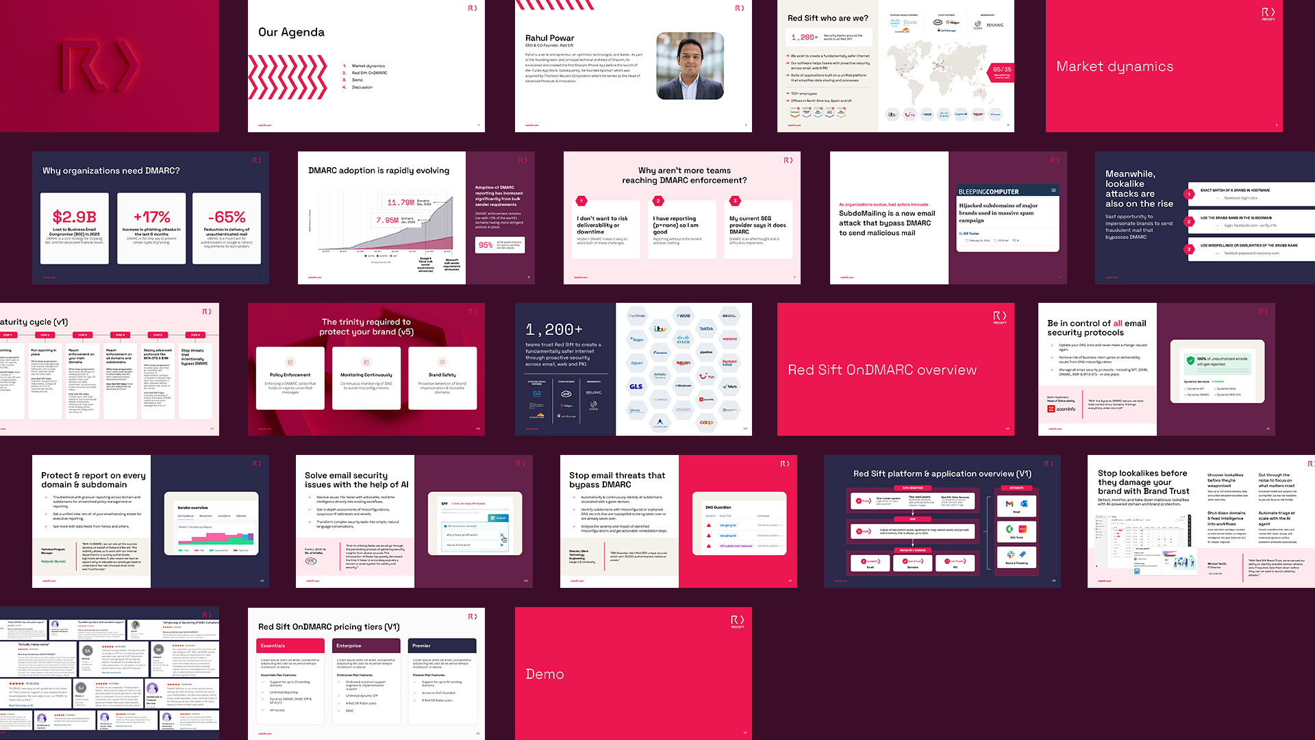
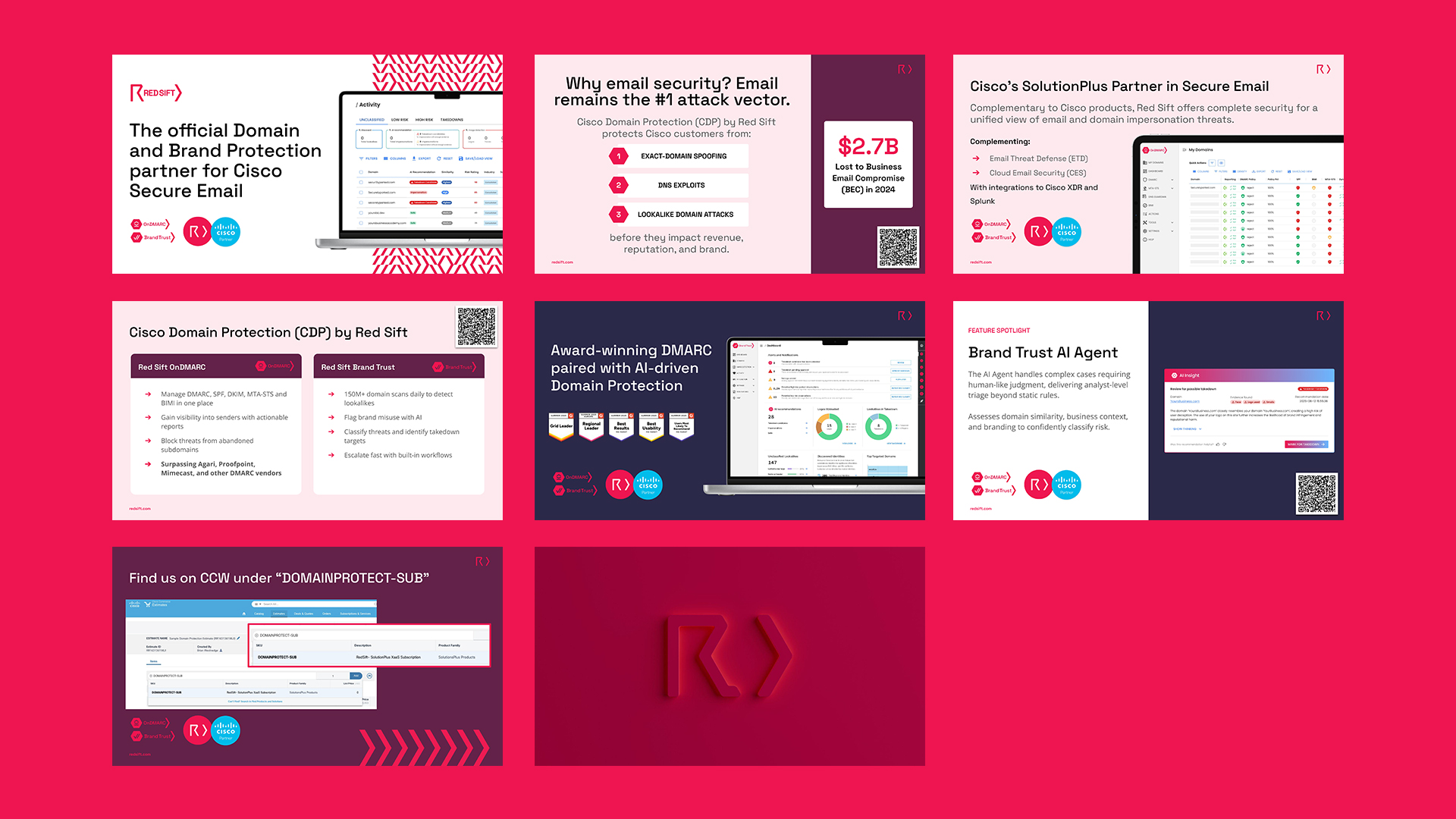
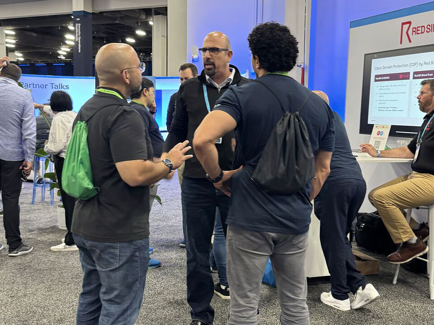
SALES DECK
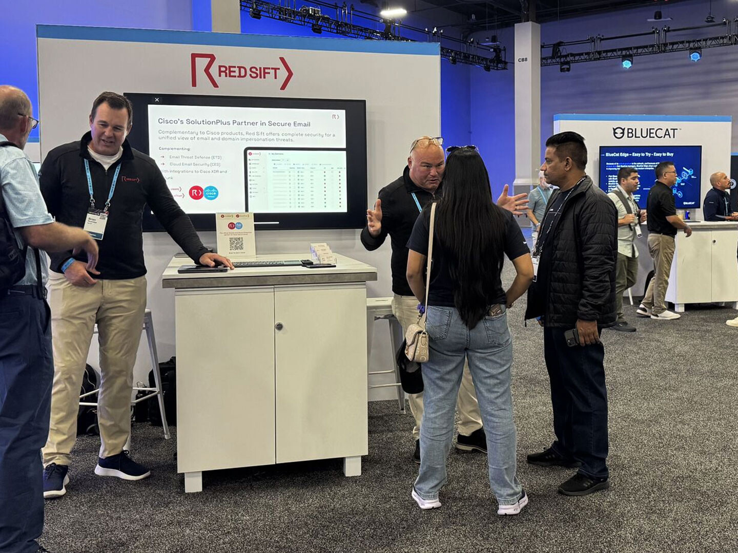
Red Sift wanted a custom-designed sales deck for the Cisco GSX in Las Vegas to highlight the partnership between Red Sift and Cisco, and at the same time target new leads.
SOLUTION
Create a bespoke sales deck from the ground up, crafted from the brand’s existing guidelines. The sales deck reflects the Red Sift brand identity, and it showcases how the two partner brands collaborate seamlessly to deliver one unified, enterprise-level service, while strategically positioning the offer to attract new leads. The clean layouts and consistent design language reinforce the partnership’s credibility and shared purpose.
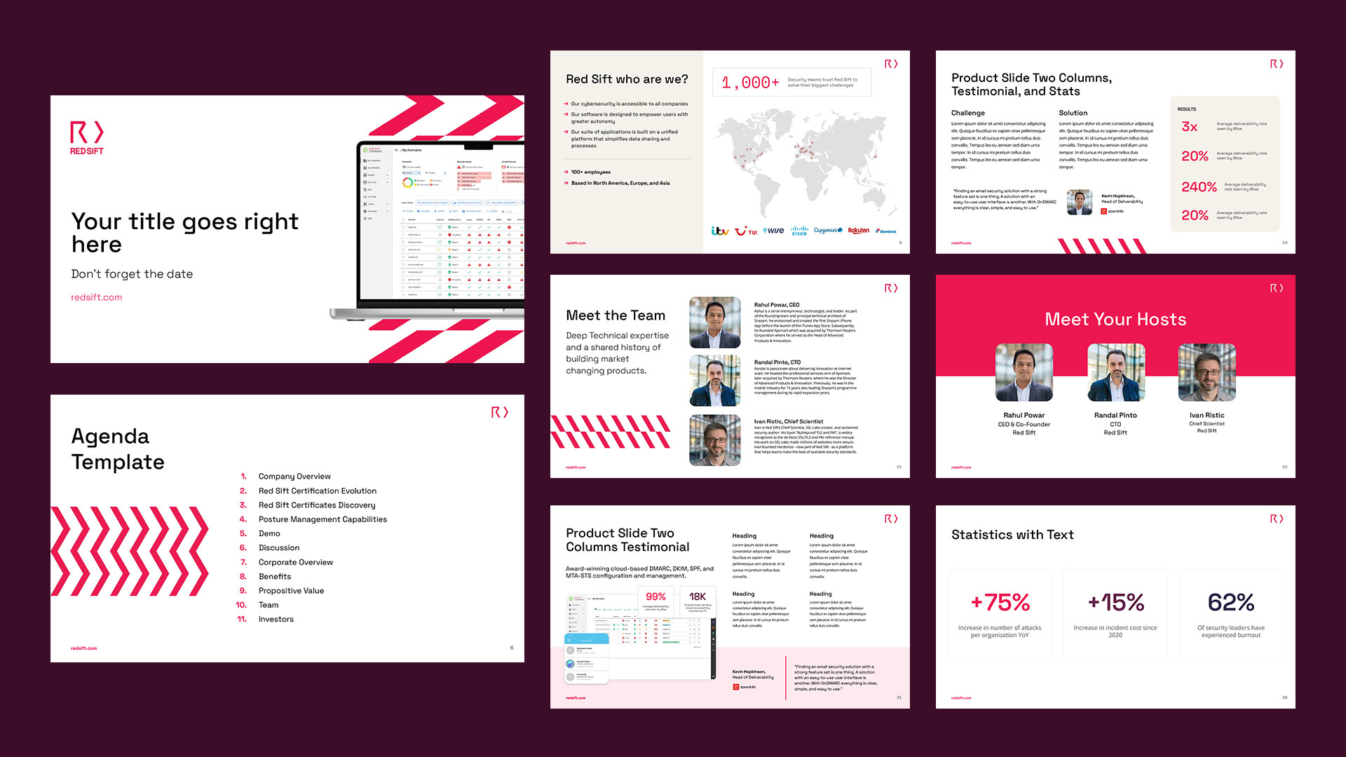
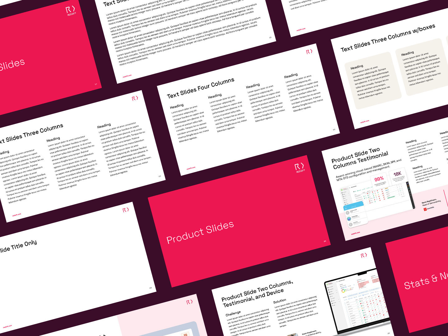
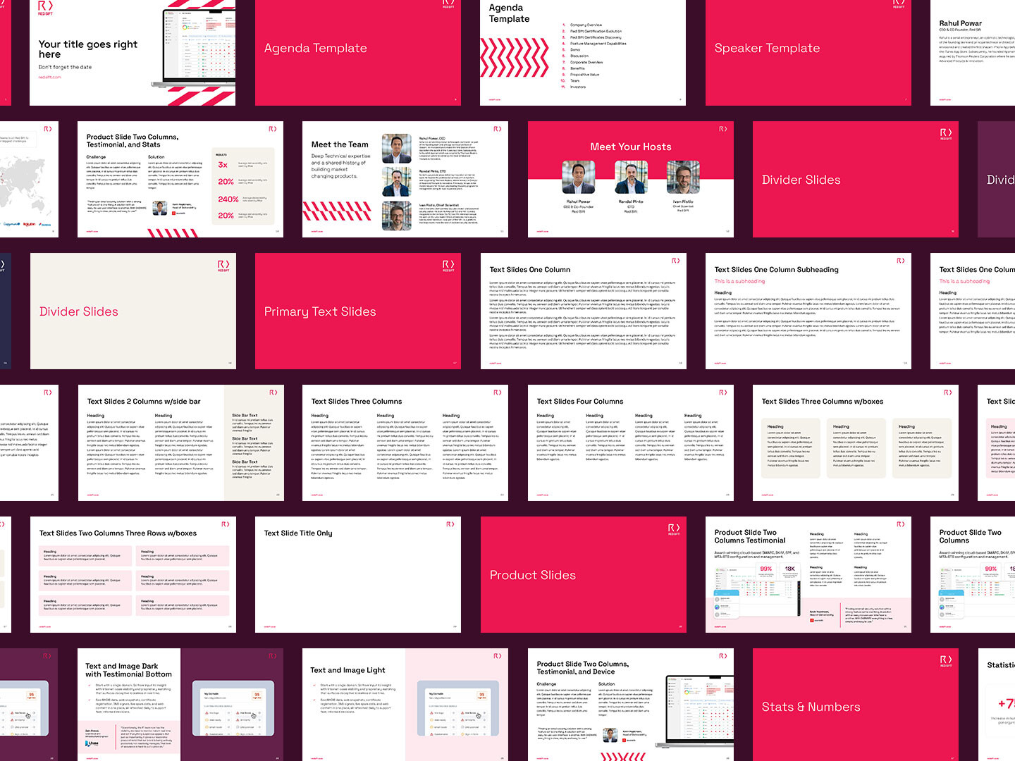
GOOGLE SLIDES TEMPLATE
Red Sift wanted a customizable, easy-to-use Google Slides for Red Sift’s teams that allowed them the flexibility of creating their own presentations while ensuring brand consistency and alignment with their brand guidelines.
SOLUTION
Created 30 customizable slide layouts for the marketing, sales, product, and executive teams to easily use and adapt. Each design incorporates key brand elements to reinforce identity and ensure consistency, clarity, and flexibility across all internal and client-facing presentations.